New Map Shows How to Cut Farm Emissions by Crop and Field
Scientists created the most detailed map ever of where farm emissions come from, pinpointing solutions crop by crop and region by region. The breakthrough gives communities the exact information they need to reduce emissions where it matters most.
Scientists just handed the world a powerful new tool to fight climate change, and it zooms in on something we all depend on: our food.
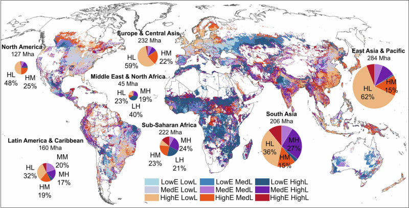
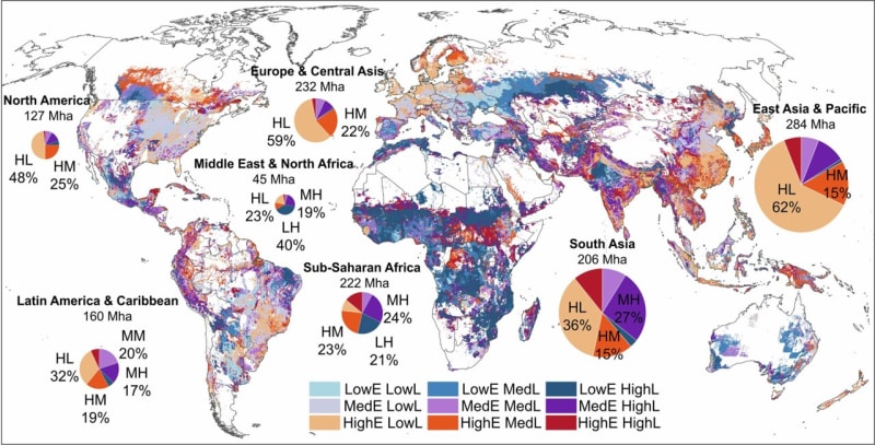
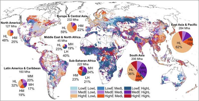
Researchers at Cornell University have created the most detailed map ever of greenhouse gas emissions from croplands worldwide. Instead of vague country-level estimates, this map breaks down emissions field by field, crop by crop, showing exactly where problems exist and how to fix them.
The timing couldn't be better. Croplands cover 12% of Earth's surface and account for a quarter of all agricultural emissions, but the last detailed global map came out in 2000. Since then, farming has changed dramatically, and scientists now have far better tools to track what's happening.
The new study, published in Nature Climate Change, found that croplands released emissions equal to 2.5 gigatons of carbon dioxide in 2020. East Asia and Pacific regions contributed about half, with South Asia, Europe and Central Asia adding another 30%.
Here's where it gets interesting. Just four crops account for nearly three-quarters of all cropland emissions: rice, maize, oil palm and wheat. Rice alone makes up 43%.
But the real breakthrough is understanding why each crop produces emissions. For palm oil, drained peatlands are the main problem, releasing 35% of emissions. Flooded rice paddies contribute another 35%. Synthetic fertilizer in high-production areas accounts for 23%.
Why This Inspires
This map changes everything about how we can tackle farm emissions. Instead of blanket policies that might work nowhere, countries and communities now have a roadmap for solutions that fit their specific situations.
"It's really local people who have to act," said Mario Herrero, the study's senior author and a Cornell professor of global development. "What's unprecedented here is that these maps provide really a crucial subnational analysis on where you have mitigation opportunities."
The research team, led by postdoctoral researcher Peiyu Cao, made another crucial connection. They linked emission levels to food production, showing which regions produce food efficiently and which don't. This matters because some high-emission regions also feed millions of people.
"A lot of studies find the regional hotspot and then say that we need to target this region for mitigation, but we think that may be unfair without considering the production side," Cao explained.
The solutions are surprisingly straightforward. Controlled rewetting of peatlands could dramatically cut palm oil emissions. Better management of rice paddies could slash methane release. Smarter fertilizer use could reduce emissions while maintaining yields.
Herrero notes that Asia holds the biggest opportunities, especially for rice farming. But he was surprised to discover that fruits and vegetables have much lower carbon footprints than expected, while peatland emissions were larger than anyone realized.
The maps synthesize data from ground sensors, satellites, historical records, hydrological information and advanced models. This gives communities and policymakers the detailed, local information they've been missing.
With limited funds available for climate action, this precision matters enormously, helping direct resources where they'll make the biggest difference while keeping food production strong.
More Images

Based on reporting by Phys.org - Earth
This story was written by BrightWire based on verified news reports.
Spread the positivity!
Share this good news with someone who needs it