UN Adopts New World Map Showing Africa's True Size
The United Nations just voted to replace a 455-year-old map that made Africa look tiny. The new map shows continents at their real sizes, finally giving Africa, Latin America, and South Asia the space they deserve.
For centuries, schoolchildren around the world have learned geography from a map that shrinks Africa to look smaller than Greenland. Last Friday, 164 countries voted to change that.
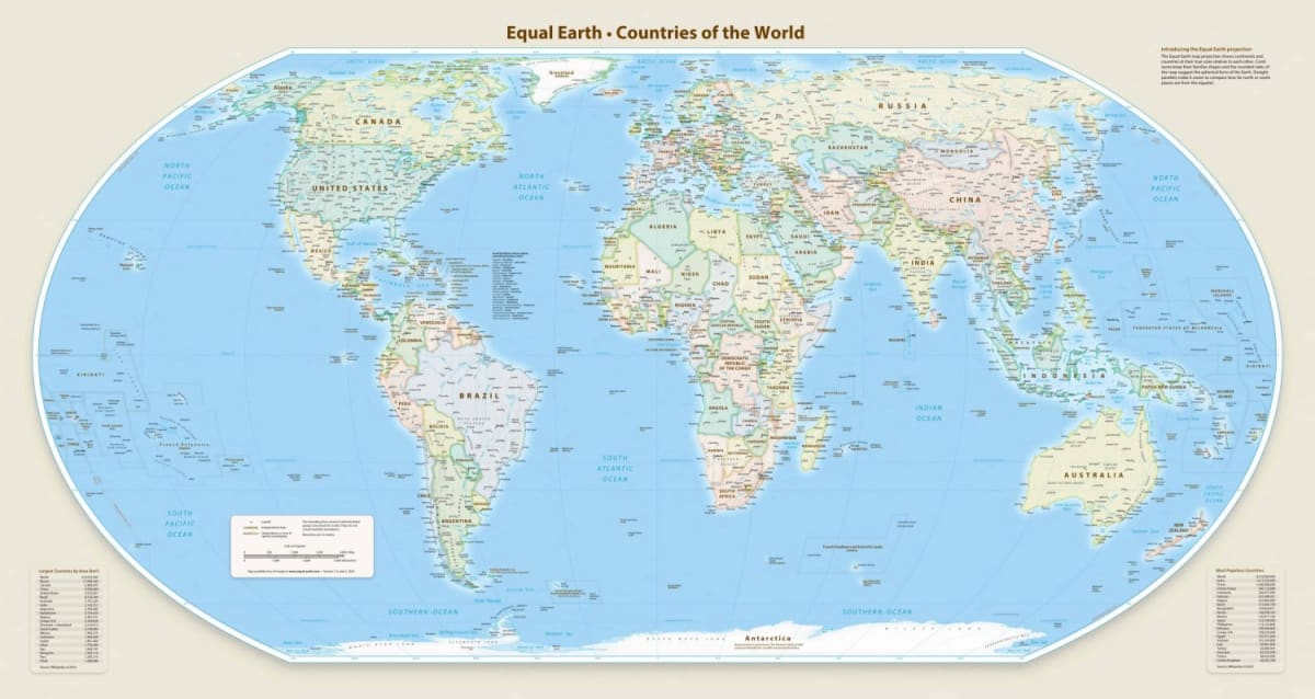
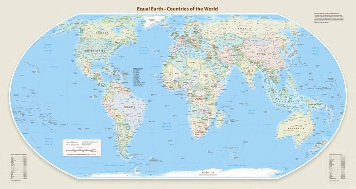
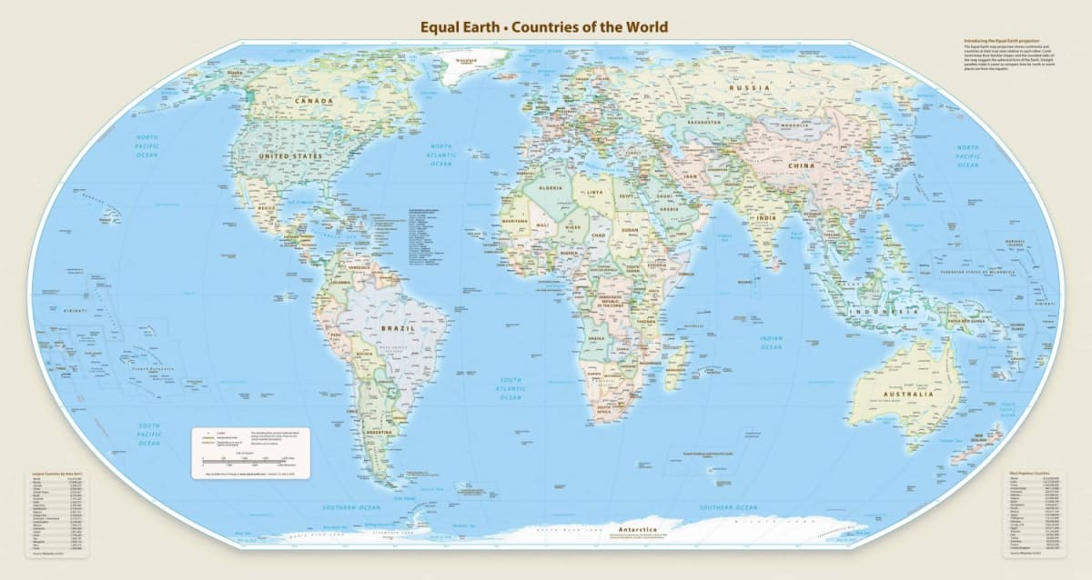
The UN General Assembly adopted the Equal Earth map projection, designed to show continents at their actual sizes. The old Mercator map, created in 1569 for sailors, made northern regions look huge while squeezing the equator.
Africa is the big winner here. On the Mercator map, it appears roughly the same size as Greenland. In reality, Africa is 14 times larger.
"Maps guide education, nourish the imagination, and influence collective perceptions," said Togo's Foreign Minister Robert Dussey, who sponsored the resolution. His country led the charge to update how we see our planet.
The new Equal Earth projection was created by cartographers in 2018 specifically to fix these distortions. It shows Africa, Latin America, South Asia, and Oceania much larger while keeping shapes recognizable.
France announced it will immediately stop using the Mercator map. Foreign Minister Jean-Noël Barrot noted that in the old version, Greenland appears almost as big as Africa while the US, Russia, and China look disproportionately prominent.
The resolution calls the change a step toward "more accurate representation" of our world. Six countries abstained from the vote, and only the United States voted against it.
The Ripple Effect
This isn't just about cartography. It's about how generations of students have grown up seeing certain continents as smaller and less significant than they really are.
The distortion wasn't intentional, but it shaped perceptions. When Africa looks tiny on classroom walls, it's easier to underestimate its importance, diversity, and scale.
Now schools worldwide can show students a map where a continent of 1.2 billion people finally gets the visual space it deserves. Teachers can explain that yes, you really could fit the United States, China, India, and most of Europe inside Africa's actual borders.
"Correcting a distorted representation is already an act of truth," Barrot said.
Maps will start changing in classrooms, textbooks, and atlases across 164 countries. A more accurate world is becoming the standard view.
More Images

Based on reporting by Japan Times
This story was written by BrightWire based on verified news reports.
Spread the positivity!
Share this good news with someone who needs it